Summary
Mission
Outcome
Impact

Finding a Niche
Q3 of 2019, PulsePoint needed a new face to match the purpose of its technology. It was a strong general market programmatic ad exchange, but PulsePoint was niching down to become the #1 Health DSP for healthcare Programmatic Advertising. While the product was growing, PulsePoint needed to evolve how what they were talking about themselves in all touch points; online, in sales calls and presentations, and at live events.
The Speed Run
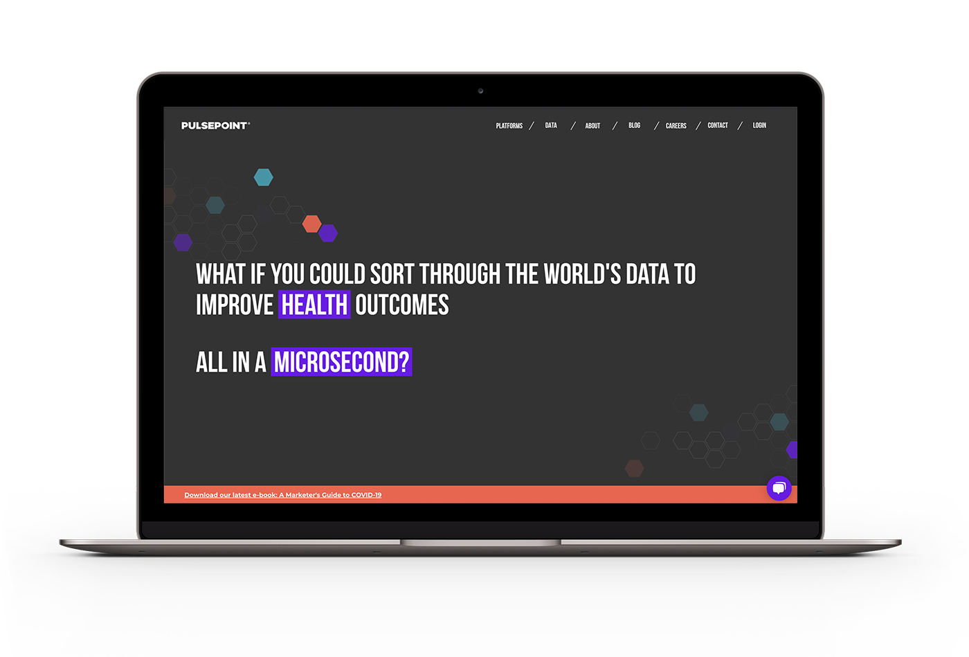
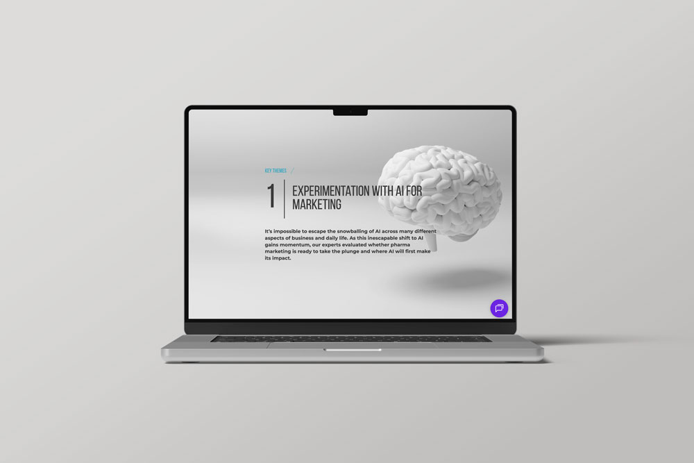
The CEO spoke often of the BHAG, or Big Hairy Audicious Goal; it was either getting the company acquired, or taking the company public. As PulsePoint was niching into health, we needed to establish what it was and who it served with utmost clarity, and find the visual language to set it apart in the standard health sea of blues, greys, and medical cross icons.
Most importantly, this had to happen fast; we needed a new site up and running in the beginning of 2020. That gave us roughly 5 months, start to finish.
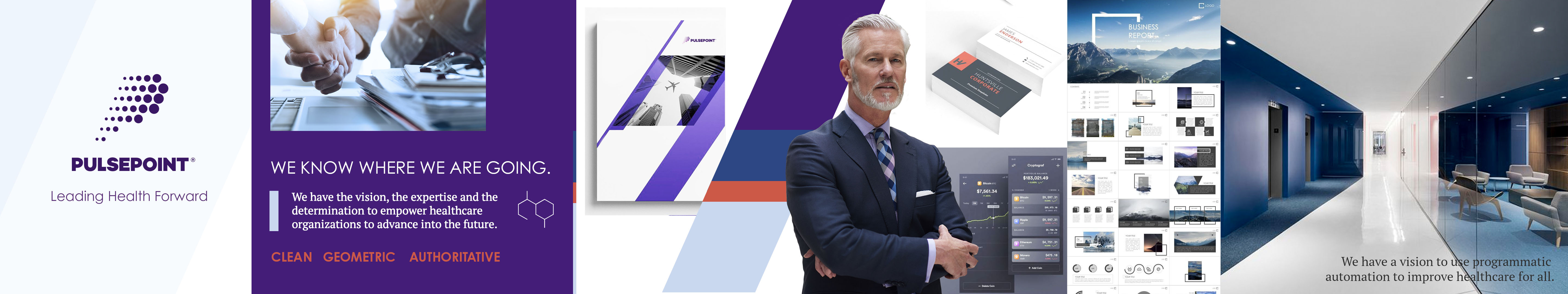
Leading Health Forward
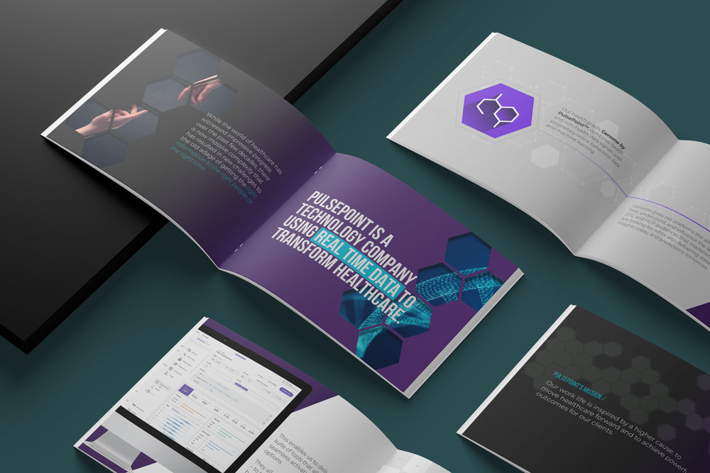
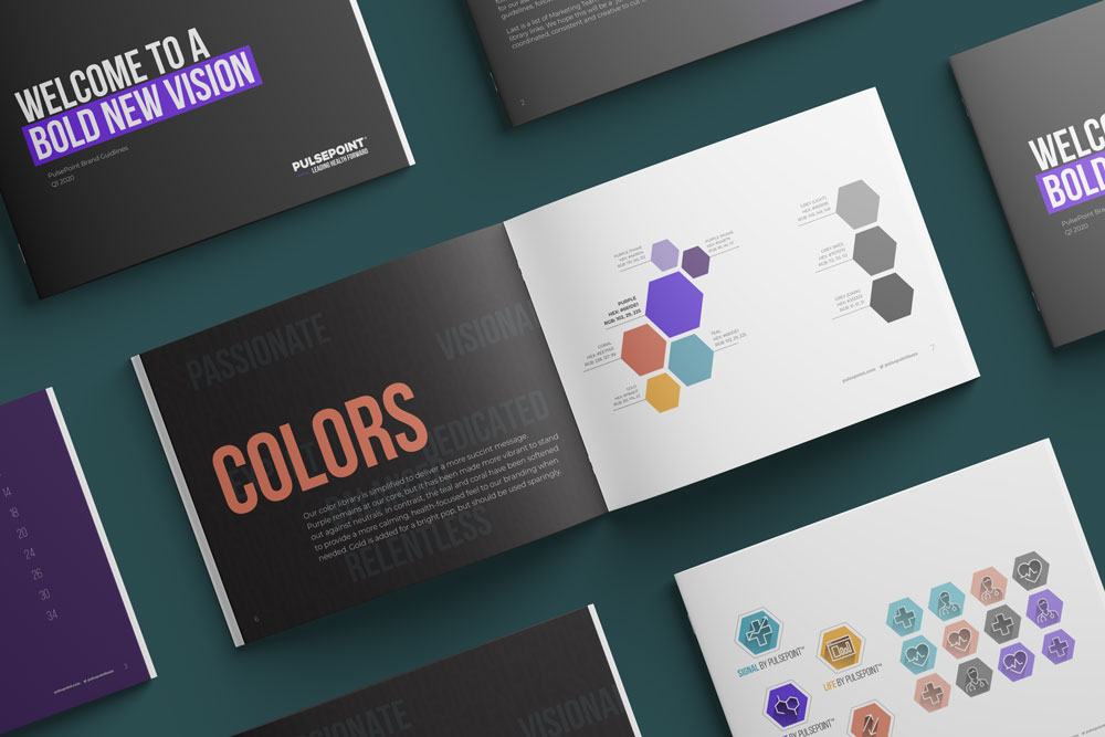
As the Creative Director on the Marketing team, we partnered with WANT Branding to take an audit of the current brand and help us to develop our manifesto, attributes, elevator pitch, and intro product and marketing copy. With this foundation in place, I started the process of concepting visuals for a new persona, which leads to the all-time favorite Stylescapes exercise. Next was rolling the chosen persona into a new brand book, following by partnering with Finsweet to help develop the site. On top of all this, we had to keep in mind our internal events and retreats and the upcoming holidays, which means updated client gifts, branded swag, and new videos and landing pages for employees

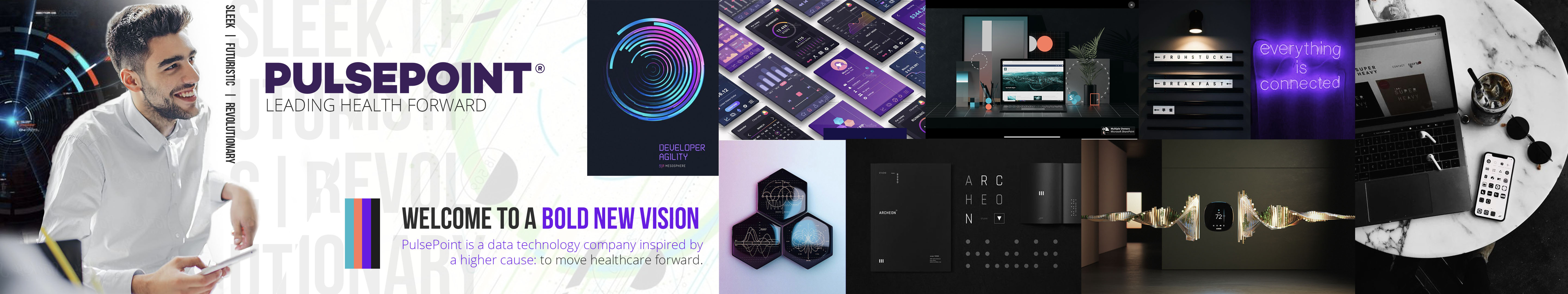
Sleek. Futuristic. Revolutionary.
The rollout was a hit all the way back to the Stylescapes exercise, because the executives got to play with the creation a bit. Before I knew it, they were referring to the brand work using the persona names; they were fully on board with the tactics and the direction.
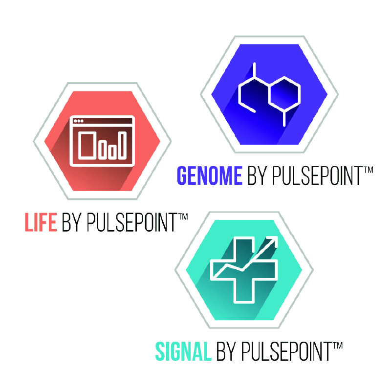
The dotted P from the old logo was removed and the tagline was added to the logo lock-up, along with the purple dash to invoke forward movement and hearken back to the legacy brand color. We revamped the color library, rolled the bolder palette into new product logos and marketing materials, and incorp
Acquisition and Expansion
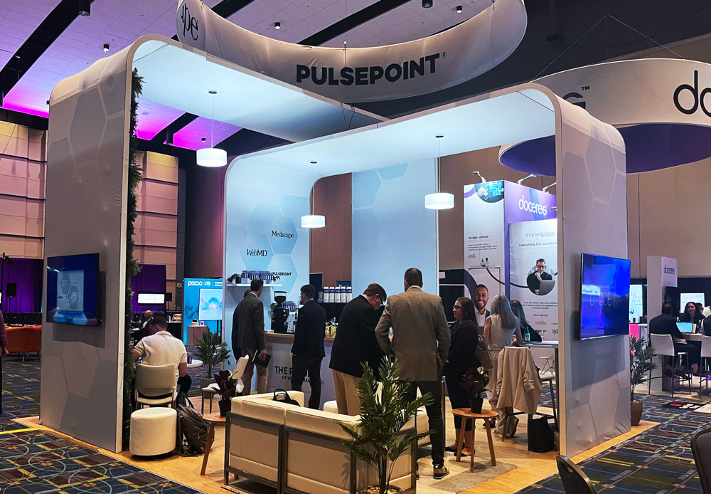
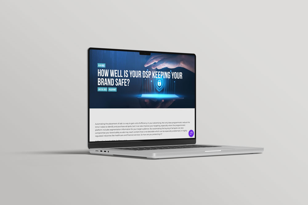
After the launch in early 2020, PulsePoint ran full speed ahead with a fresh identity and a firm foundation as the health expertise within programmatic marketing. While COVID removed a lot of in-person activations for the year, the solid brand was able to fully show up through a ramped up thought leadership push, a dedicated pandemic response case study to help increase vaccination rates, and a virtual edition of its annual Digital Health Forum. In particular to the website, conversions increased 180% YoY from 2019 to 2020, proving that going back to the company's values to rebuild made the brand story finally clear to sought after health audiences. And with PulsePoint being purchased by WebMD in Spring 2021, the BHAG was achieved.
Post acquisition, I continued working on the brand evolution and how it now fit within a larger family. This bigger family now meant the visuals would go through another shift, and I remained on board to aid the shift across new landing pages and even larger scale events.

Ready to Evolve Your Brand?
Reach out to take your identity to new heights.